Tuesday, 31 January 2017

Royal Academy of Arts- Abstract Expressionism: Outside sculptures

On the 1st of December, I went to the Abstract Expressionism exhibition in the RA. Before you entered the exhibition there was these four sculptures by David Smith. David Smith was shown quite a lot through the exhibition of nearly every sculpture shown was Smith's. 


Photo- I took of the book that I got at the exhibition


Abstract Expressionism

Davis Smith
b.1906, Decatur, IN; d.1965, South Shaftsbury, VT

As the key first-generation Abstract Expressionist sculptor, David Smith created an output that spanned a great range of themes and effects. The works here represent four of the climactoc series that Smith produced from 1956 until his untimely death in 1965. They encompass rising forms that evoke the human presence (albeit in abstract terms) and others in which a more stern character, by turns mechanistic or architectonic, prevails.

The Annenberg Courtyard display seeks to recreate the spirit of Smith's installations on his fields at Bolton Landing in upstate New York. There, not only did each sculpture enter into a silent dialogue with others, but they also responded to the space and sky around them. Thus, for example, the Cubi's dazzling stainless-steel surfaces answer to the brooding, inward darkness of Zig III.

Often, Smith's imagery and ideas parallel concerns seen throughout Abstract Expressionism in general. As such, further pieces by Smith stand at crucial junctures in the Academy's galleries in order to amplify this sustained interaction between sculptor and painters, two and three dimensions. 


The four sculptures had a very interesting relationship with the space, Sir Joshua Reynolds' statue and the exhibition itself. 

Photo of 1. Zig III, 1961
Painted steel

Photo of 1. Zig III, 1961
Painted steel

Photo of 2. Sentinel V, 1959
Stainless steel

Photo of 2. Sentinel V, 1959
Stainless steel

Photo of 4. Voltri Bolton X, 1962
Steel

Photo of 4. Voltri Bolton X, 1962
Steel

Photo of 3. Cubi XXVII, 1965
Stainless Steel


Smith's sculptures relationship with the space, really opened up the exhibition to the audiences in my opinion, through the way the sculpture gives you a pick into the exhibition without going in. Maybe even if someone has got a ticket, might get interested with the sculptures and get one to see more. Also, because Smith was a key first-generation Abstract Expressionist sculptor, for his work to be outside as the first look to the exhibition, it shows the importance of the artist within this movement and the show itself. (key note, for a practical way these sculptures of Smith's are too big and heavy to be placed within the building).

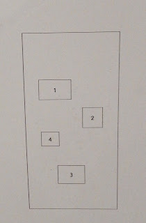
The sculptures were laid out like this:


Photo of layout of sculptures
Photo of the pieces on the layout
Also the layout makes sure that his different coloured sculptures are shown in different areas for a contrasting effect between the darker and lighter sculptures.

The relationship between Smith's sculptures and Sir Joshua Regnolds statues is that all of them are sitting on a concrete plinth to rest them off the group to give them more important than everything else around them. However, Sir Joshua Regnolds statue is rested higher because of his importance for the Royal Academy through its history. The interesting thing this that the plinth makes all the different pieces of art in the same type of important by resting them. But with that the old style of Sir Joshua Regnold statue and the abstract sculptures of Smith are now in the same important even though they are very much different works.     


Self portrait of Sir Joshua Reynolds
Sir Joshua Regnolds
(16 July 1723- 23 February 1792)
He was a founder and first president of the Royal Academy of Art, and was Knighted by George III in 1769.


Photo, take I took of Sir Joshua Reynolds statue
Overall, I felt that Smith's outside sculptures were a very interesting opening view of the Abstract Expressionism exhibition and has opened me to seeing a new way to lay out my own work. 

Sunday, 22 January 2017

Royal Academy of Art- Abstract Expressionism

On the 1st of December, I went to the Abstract Expressionism exhibition in the RA. This exhibition was very interesting and opened my eye to a different ways I can use my ideas to make an outcome. Also, I learned how to create a lot of detail through there not being a realist image show through the media that you use.


Photo- I took of the book that I got at the exhibition
As well, I learnt more about the history of Abstract Expressionism and the range of styles that the different artist showed through the movement. From sculptures to large and small painting to photography, they all had many different styles within them, making for a diverse viewing experience through this exhibition.


Photo I took of the statue and the flag/sign
This exhibition also opened me to many different artists that I am thinking of using within my practices, in the likes of Lee Krasner (1908- 1984), where I saw her piece called The Eye Is The First Circle (1960). Krasner does a style of work which really connects closely to my type of work through the way I use natural elements, mud and clay. Krasner uses a natural pallet but she uses oil paint instead. However, I feel that the way she create so much movement within her piece, this a painting style that I feel that I can really work within my practices.

Krasner was a major figure in the American Abstract Expressionist movement. She mainly worked in oils, inks and mixed media collages. She used her own cut up paintings and drawings to create large collages. She exhibited with the American Abstract Artist group and met her husband Jackson Pollock through these exhibits. She was greatly influenced by Herri Matisse and Piet Mondrian and studied under Hans Hofmann. “Painting… in which the inner and the outer man are inseparable, transcends technique, transcends subject and moves into the realm of the inevitable,” she said, freeing her from formalised structures. 

Krasner's piece of me has many different hidden images, within the exhibition I was talking to a fellow student and they said to me that they could see a tiger within a jungle on the left side of the painting. Also, you can see many different faces and shapes with look like quick drawings of eyes. This to me add depths to this piece because there is some much different detail to this piece to make for many different interpretations from the audience/

Image from www.artsy.net (couldn't take photos at the exhibition)
Also the layout relationship between Krasner's and Pollock's and David Smith work within the exhibition was very interesting that workout and learn. So straight down the walk way past other artist's work is the part where Pollock's two main large piece which mirror each other. The Pollock piece that mirror each other are Mural (1943) and Blue Poles (1952). They mirror each other through the way it shows the evolution of Pollock's work, there is a 9 year difference between.

Jackson Pollock (1912- 1952)
Mural
1943
Oil and Caseinon canvas

Image of Mural from uima.uiowa.edu (website)
Commissioned by Peggy Guggenheim in the hallway of her Manhattan townhouse, this is Pollock's large work. Mural's vastness heralds a new energy and scale in Abstract Expressionism; by no coincidence, both Rothko and Gorky produced their largest canvases, the following year. The painting, abstract style permits the suggestion of many forms, these vestiges of figuration reflects Pollock's creative struggle with Picasso. 

Smith's sculpture 'Tanktotem 3' (located nearby) evokes a prancing bestial presence spun at of Mural into three dimensions. 


Image of Tanktotem from
http://pastexhibitions.guggenheim.org/
(website)


David Smith began his second series, the Tanktotems, in 1952. In these works he established a bold new aesthetic statement, dispensing with pedestals and creating sculptures that could stand directly on the floor. Tanktotem 3 I was told that the shape that the sculpture is similar to the shapes that are in Pollock's Mural piece. I found this very interesting that the layout in the RA show the relationship between these two artists and how one artist get inspired by the other to create their piece.


Jackson Pollock
Blue Poles
1952
Oil, enamel and aluminium paint with glass on canvas

Image of Blue poles from http://www.jackson-pollock.org (website)

The Most iconic of Pollock's late-period paintings, Blue Poles represents one of the pinnacles of his achievement. Its position here, opposite 'Mural', effectively 'book ends' the climatic decade of Pollock's meteoric career. Its seeming spontaneity actually belies the careful process of its creation, while tiny shards of glass embedded across the surface amplify its spectacular, crackling forcefulness. The stricture makes reference to the composition diagrams used by Pollock's teacher. Thomas Hart Benton, as well as to the 'processional' figuration that Pollock first definitively established in 'Mural'. 

The main element in this piece which interested the most was that there was more to this paint then I thought there was. For example there is bits of broken glass within the paint that adds more detail and depth to the piece when you see it in person. This made me enjoy this piece more because I have seen this piece many time but only within books and online, mean that I never got to see the amazing levels of details that Pollock has been able to make within this piece. This has now inspired me within my practice to found and made more hidden elements to make more details within my pieces.   

The interesting relationship between Pollock's own work and David Smith show me an effective way of layout work. However, even though I do like all the different piece I still feel that their style doesn't work into my practices so I'm not really going to use them throughout. But I will be looking in more depth at Krasner's work because she fits my style more.


Overall, The Abstract Expressionism exhibition was a very enjoyable and eye opening experience and I was able to come up with many different ideas from looking at these different artists within the exhibition.


Tuesday, 6 December 2016

Walk the Canal

On Thursday the 24th of November we went on a trip to walk next to the Canal from Warwick Avenue to Paddington Station and draw when we see in the process.

Google Maps of where we walked
This process of walking and drawing was a very interesting and beneficial task through the way to draw what I wanted and to keep up with the rest of the trip, I had to draw quite quick which created a chrip, quick movement type of mark from the charcoal. With this I captured parts of the areas that I was at and because I was drawing quite fast my drawing didn't have that much detail making for a quick snip it of the area that I was at. 


This is a drawing of one of the Cabmen's Shelter Fund which I have seen before but never know what it really was till that day. It was very interesting to found out information about hidden history on old building which are scattered around the UK.  


Image of one of the Cabman's Shelter at Warwick Avenue
Image by Prudence Ivey
The Cabmen's Shelter Fund was established in London, England, in 1875 to run shelters for the drivers of hansom cabs and later hackney carriages (taxicabs). 
By law, cab drivers could not leave the cab stand while their cab was parked there. This made it very difficult for them to obtain hot meals and could be unpleasant in bad weather. The Earl of Shaftesbury and other worthies therefore took it upon themselves to set up a charity to construct and run shelters at major cab stands.

These shelters were small green huts, which were not allowed to be larger than a horse and cart, as they stood on the public highway. Between 1875 and 1914, 61 of these buildings were built around London, the first being on Acacia Road, St John's Wood.
Thirteen of the shelters still exist and are still run by the Cabmen's Shelter Fund. All are now Grade II listed buildings.


Trying to capture different parts of the places that I have seen within the walk through that day really interested me through the way the lack of time really opened to my style of drawings because I really like creating, abstract, non realist looking drawings that still capture elements of the real object or place that the drawing is coming from. The lack of time made for me to move the charcoal quite quickly which made for interesting drawings and opened me to s style of drawings that I will like to carry on. 


Also we have a quest teacher on the trip with us called Aldous Eversley and he was also do drawing as we where going on the walk. I learn a new way of drawing through using Chinese ink set, where you place the brush into the water first then into the ink. How long you leave the brush in is how light the ink will come out.


Photo: I took of Aldous' drawing


With that I feel that I want to go and try out that style of drawing and link it within my style of art because I really feel that is it close to my style of drawing and how I like to show my drawings.

Overall, the trip was very enjoyable and I learnt a lot about my drawing style and how I can improve and adapt my drawings.

Monday, 5 December 2016

Morning Departure Exhibit: Work By Ian Fraser

Between the 8th to the 23rd November there was an exhibit of work by a ex-teacher of Middlesex University, who pasted away,shown in The Atrium in The Grove Building. This is an introduction of the exhibit which was written in the hand book:


On behalf of Middlesex University, it is a great pleasure to host this exhibition of the work of Ian Fraser. Ian was a full time lecturer in Fine Art at Middlesex long before it became Middlesex University. His teaching career spanned the time that Fine Art was a subject delivered at Hornsey College of Art in Crouch End, through to Middlesex Polytechnic at Alexandra Palace, briefly again at Crouch End and finally at Quicksilver Place in Wood Green, where he was to become Head of Department. This was to be a brief tenure due to Ian's tragic death in 1986, at the age of 53.
(Simon Read, 1 October 2016)

Photo: I took of the handbook
Photo: I took of the layout of the exhibit 
Photo: I took of the layout of the exhibit
Photo: I took of a close up of the exhibit

Morning Departure

"For a graduate from the Royal College of Art in the 1950's, the opportunities to earn a living as an artist were stark; Ian was married to Anna and with burgeoning family responsibilities started working full time in what was then further education...it is remarkable that artists of Ian's generation were so very prolific."

"The particular model of artist using a specific skill set to reflect upon the ebb and f.ow of a lifetime's experience is often considered secondary to that more familiar insistence upon a signature style."

"Shepperton, where Ian lived with his family, is right beneath the main flight path into Heathrow, the presence of low-flying aircraft...in his painting they become ephemeral and transient events suffused with wistfulness." 


(Simon Read, 1 October 2016)


Photo: I took of a lot of the 'Time-based' pieces
In Ian’s words, written in November 1986, just weeks before he died:

‘My aim is to produce pure poetry, without recourse to secondary imagery. I realise on reflection, that this is a fairly vague definition of intention, but I prefer to leave it so, for I do not subscribe to any particular theoretical credo – I paint according to my intuition and therefor rationality is a subsidiary factor. I seek a kind of perfection, which is a risky confession to make and perhaps not very fashionable. I know that I must inevitably fail, but to achieve even a hint of success (in my own terms) makes it exciting in that maybe I will get nearer next time. The perfection I seek must be distilled from the essence of the activity – the colour, tone, disposition, spatial allusion, paint quality. There must be a tranquillity, which is nevertheless dynamic and therefor poignant. It must be clearly evident that the work is executed by human hand – scale is more important than size. Bravado paintwork must be avoided, however tempting, for it brings the attention entirely to the surface, destroying spatial possibilities the viewer may interpret. Yet the surface must retain its integrity – I seek no optical tricks, but rather to prompt. Colour is, of course, cardinal. There can be no end to the associations it may conjure, it is the inexhaustible stuff of painting, with its implications of light, of life and death. 

The other important element involved is time, painting being as much a ‘time-based’ medium as film, although it operates more in a potential than a kinetic form. It is partly for this reason that I ‘usually’ give my paintings no other title than the date on which it was last worked upon. The other reason is purely practical – so that I may know when I can safely apply varnish as a protective coat.’ 

Looking at these pieces, they have gave me inspiration on how to layout walk within a exhibit. I really like the neat layout with the smaller and bigger pieces mixed together to create a whole piece of work. 


Piece 1:

Photo: I took for 12_2_84 (1984)
12_2_84 by Ian Fraser is an abstracted lopsided rectangle with is made up of pastel coloured squares and rectangle which makes up the overall rectangle. Contracting with the pastel colours there is a black rectangle which stand out within the piece making it more of a focal piece. By Fraser using more pastel colours within this piece it makes the rectangle blend more into the background because the canvas itself is made from a more neutral light colour which is similar to the pastel colours. An important element within his piece like is, is time. "Painting being as much a 'time-based' medium as film, although it operates more in a potential then a kinetic form." (Ian Fraser, online, http://www.ianfraser-arca.co.uk/blocks.html ). 

This make for an interesting element to his pieces because by looking at the pieces, you would never know it is a time-based piece through the way most of the time, time-based pieces are films, photos or performers. So for it being a painting its quite unusual. There is evidence that his paintings are time-based through there is no other title than the date on which it was last worked on. 

Piece 2,3,4:
VICTIMS - IMAGES OF FEAR & COMPASSION (1980-1983)

A extract from a letter sent to the Bishop of Ely, April 1985

“… About 18 months ago, I completed a series of paintings the intention of which is to express a mixture of fear and compassion which I assume to be a feeling common to outrage, in which implied or actual violence is a constant state. I found the subject of implied violence to be more poignant than the depiction of actual violence, with more chance of avoiding sensationalism in favour of images promoting a quieter, more reflective response."

I must quickly explain that I do not wish to sell the paintings, but to lend them for exhibition in a particular environment. While painting them, my mind returned repeatedly to the holocaust of more than forty years ago as a cataclysmic example of man’s fearful ability to dehumanise others of his kind. The paintings are not meant, however, to be pro-Jewish nor anti-German; it is implying that the magnitude of those horrendous events served as a thematic key for a subject which has, unhappily, wider implications. 

You may well think by now that it all sounds very dark and tragic. You would be right. I make no excuse for expressing the grimmer aspects of our condition, but I would like to use the results in a positive and regenerative way.

My reason for choosing Ely … the sight of almost all of the stone figures having been decapitated or defaced struck an obvious chord for me … it would be in keeping for the work to be shown in an English church, rather than a synagogue. …” 

(Ian Fraser, online, http://www.ianfraser-arca.co.uk/victims.html)

Photo: I took of piece 'nientytutiwany' (untitled) 1983

Photo: I took of apart of the 'nientytutiwany' piece
nientytutiwany by Ian Fraser is a dark piece with two faceless fingers standing on ever side of the canvas covering themselves with they're hands. This is a quite interesting piece through the way Fraser has create an ominous feeling to the audience by the piece being painted with black paint for the background and there being faceless fingers. Faceless fingers make for a more ominous feeling because as humans we naturally look for facial expressions on people but for there not to be any, we naturally feel like there is something wrong happening.

 “… About 18 months ago, I completed a series of paintings the intention of which is to express a mixture of fear and compassion which I assume to be a feeling common to outrage, in which implied or actual violence is a constant state. I found the subject of implied violence to be more poignant than the depiction of actual violence, with more chance of avoiding sensationalism in favour of images promoting a quieter, more reflective response." (Ian Fraser, online, http://www.ianfraser-arca.co.uk/victims.html). 

Showing that the pieces have a hidden meaning of deep, dark emotions which partly contrasts with the images on the piece because the fingers are faceless meaning that they have no emotions but I feel that the emotions are more shown through the body language through the way they want to hid, looking like they really don't want to be there. Also, another way to show the dark emotions is through the colour plate because there is dark, dirty black which spreads the dirtiness to the finger through the way the gold fingers have dark grey/black around the fingers. 

Another interesting element to this piece is that Fraser has scratched into the bodies of the fingers which makes a sgraffito effect. This adds some hidden texture with make the audiences look more closely to the piece to see the texture. 

Photo: I took of Dosyc (Enough) 1983

Photo: I took a closer part of Dosyc

Dosyc (Enough) 1983 show the emotions more clearly within this piece because there is a shouting face shown through more detail of the facial expressions within the face and through the way Fraser has scratched in teardrop to the face making more emotions shown.

I must quickly explain that I do not wish to sell the paintings, but to lend them for exhibition in a particular environment. While painting them, my mind returned repeatedly to the holocaust of more than forty years ago as a cataclysmic example of man’s fearful ability to dehumanise others of his kind. The paintings are not meant, however, to be pro-Jewish nor anti-German; it is implying that the magnitude of those horrendous events served as a thematic key for a subject which has, unhappily, wider implications. 

Photo: I took of Preparation for the Holocaust 1982-83


The can be reflected through his piece called Preparation for the Holocaust 1982-83 because there are faceless finger lined up just like people within the concentration camp where all lined up and they where seen as faceless people because they where seen as non people and all the same.

Piece 5:

RAINBOW (1969-73)

The origins of these paintings are in studies Ian made in 1970, whilst a visiting Professor at the University of Wisconsin-Parkside, USA. 


On return to England in Summer 1971, Ian scaled up his sketches into large paintings 2m high x 5m long. The paintings are not stretched, but are hung from eyelets regularly spaced along the canvas edge. Ian also produced etchings, screen-prints and small gouache paintings. 

The paintings are inspired by the environment, water, light and the epic scale of landscape. One is titled ‘Greenwell Glory’, which is the name of a well-known trout fly (Ian was a keen fly fisherman). Another is titled ‘Grassington’, after the North Yorkshire town on the River Wharfe, where Ian fished as a boy. 

In 1973, Ian wrote to Jenny Stein at the Whitechapel Gallery: 
“Since I saw you, I have completed another ‘rainbow’, one which has been on my mind for more than three years! It is, in a sense, a definitive one of the series and I would like you to see it, if that is at all possible. It’s the same format as the two you saw and is a black rainbow (‘Black Fell’) – a rather tragic image, I find, with connotations of ecological disaster – sounds a bit trendy and symbolic, which I hope it isn’t! "

(Ian Fraser, online, http://www.ianfraser-arca.co.uk/victims.html). 

Photo:I took of Portland (Rainbow) 1973-74
Portland (Rainbow) 1973-74 is very interesting through the way Fraser has painted a landscape on a long stretched out piece of fabric because I found art that is abstracted which has come from nature and landscapes to have a interesting aesthetic. I'm really interested to reflected this style of abstracting landscape within my own art. 

Sunday, 4 December 2016

Darko

From Friday 14th of October to Thursday 17th of November, I have been attending a student run art gathering called Darko.  Darko is a fortnight run gathering for any art student from Year 1 to Master to came and create a page or two for the Darko magazine. Darko is run by three Year 2 student, before you arrive they give you a word of the week for the event and then you have to create a page that links to that word.

Giving one word makes for a interesting but also hard process to create a page because the words are normally very broad and have a lot of different meanings which makes for a very openly creative process. However, I also feel that it makes it easy for interpretation so it makes for a more enjoyable experience for everyone to create their pages.

Another interesting thing about Darko is that, you have to create your piece in a A5 format so it makes you think carefully about what you can create within a small piece of paper. Also the whole magazine is made out of a 100% recycled paper which makes for a positive message within the magazine which promotes recycling and looking after the planet.

Friday 14th of October

Photo: I took of the magazine
This was the first magazine that was created with the theme 'Falling'. Do to the way the themes are quite broad there is many different interpretation within one theme. I feel that it creates a very unique idea for a magazine because most magazine have one style and only one style to their magazine but with this one, it has many different interpretations giving each magazine a different look to it.  


Photo: Of my own piece
Because the theme was 'Falling' I chose to create a piece inspired by Autumn's falling leaves because I love the season and I love to use mixed media so leaves made for a great idea for my piece.

Wednesday 2nd November

Photo: I took of the magazine

For this magazine the theme was 'Set' which has over 400 different meanings this made for a very open interpretation.


With the the first one I went with the idea of sets of wood and with the second, different ripped sets of paper.

Thursday 17th November

Photo: I took of magazine


For this magazine the theme was 'Limbo' so I chose to create an idea of a dark, urban place where there is no freedom and wildlife which can only be accessed by a rope bridge to the other place which is bright and has freedom and fun. This creates a sense of Limbo because the people in the dark place are in Limbo waiting to be able to cross to the light.

Darko is a very interesting and creative magazine that I am so gratefully to be apart of and I can't wait till the next one. 

Wednesday, 9 November 2016

Auto-destructive

I watched a 40 minute, BBC4 documentary about art school in the 1950/60's and how art school shaped the art world.

About 28 minutes in the documentary was talking about how art school had an impacted on pop music in the 1960/70's. This was shown through the way Pete Townshend (singer, songwriter and guitarist from the British Rock band, The Who) learnt about the artist Gustav Metzger. Metzger created is own art term called Auto-destructive, where he destroys objects and through that art was created. This feed into the style of music through the way they experimented with feed back when the smashed up their own instruments.


Gustav Metzger

Gustav Metzger
Recreation of First Public Demonstration of Auto-Destructive Art 1960, remade 2004
© Gustav Metzger
(On Tate website)
The term Auto-destructive was created by Gustav Metzger during political unrest known as The Cold War, soon after the end of WWII. The use of nuclear weapons by the U.S against Japan in 1945, left a deep impression on the whole world. In reaction against this the anti-war group The Committee of 100 which might was been named by Metzger, was formed in 1960 and Metzger began making paintings using acid as a form of creative protest.
Auto-destructive art was automatically political; also carrying anti-capitalist and anti-consumerist messages.  It addressed society’s unhealthy fascination with destruction, as well as the negative impact of machinery on our existence.

"The idea of Auto-destructive is that the destruction and decay of things/ objects was a suitable subject for art." (Brian Eno) 

Sonic Sabotage: The Noisy History Of Auto-Destructive Music Robert Barry , March 5th, 2015 13:41
(On Website)


29 minutes in there was a part where destruction artist smash up a piano for 24 hours in September 1966. This really interested me through the sound that is created in the process of destroying an object. Through this my friend and I got an old piano and he smashed it up and I filmed is so I could get the interesting sound.


First video of the piano getting smashed 


Second video, were the hammer is hitting the kegs

Through the smashing of the piano there was a very interesting sounds from the wires inside the piano vibrating and creating there own unique sound. I found that natural sound that is created through an action to be very captivating through the way, every time someone makes an action the sound that is made each time is very different.